By Markus Kammin, VP of UX, Haiilo
If you’re responsible for your company’s intranet – from an internal comms, HR, or employee experience perspective – you’ve probably heard these before:
“I can’t find what I’m looking for.”
“Too much information. I just need the key updates.”
“It’s cluttered.”
“I don’t use it unless I have to.”
That doesn’t mean your intranet is failing. But it likely means it’s carrying a kind of silent burden: UX debt.
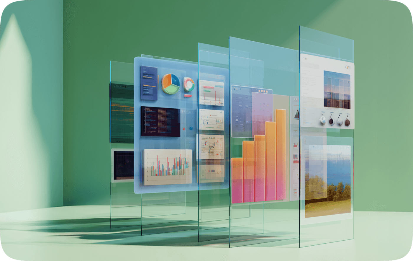
Much like technical debt in software, UX debt builds up slowly. It’s the result of good intentions layered over time without a clear strategy, and it shows up as bloated homepages. Endless menus. Unclear ownership. Too much content, too little relevance.
The good news is it’s fixable. And at Haiilo, we’ve spent years helping customers design intranet experiences that aren’t just beautiful, but genuinely useful – tailored to how people work, not just how information is structured.
What is UX debt, and why does it matter?
UX debt builds up when intranet design decisions prioritize short-term fixes over long-term clarity. It’s when:
- Content gets added without clear ownership
- Layouts vary wildly from section to section
- Pages become dumping grounds for everything vaguely “important”
- Navigation is built reactively, not strategically
The result is an experience that technically works, but practically frustrates. Employees spend added time clicking, reading, filtering. Productivity suffers. Trust in the intranet declines. And the very tool that should simplify communication becomes just another obstacle.
Empathy: the foundation of effective intranet content
Let’s talk about empathy.
In UX, empathy isn’t some buzzword, it’s a genuine discipline. A conscious shift from thinking “what do I want to say?” to “what does my colleague need to know?”
This is especially important for content creators: HR teams, internal comms, local admins. Every message, update, or announcement should respect:
- People’s time
- Their task context
- Their cognitive load
Ask yourself:
Will this help someone complete a task faster?
Is this the minimum they need to stay informed?
Can I say it in fewer words?
Empathetic content is not less human. It’s more considerate, rooted in real-world usage and workplace demands.
Brevity isn’t lazy. It’s user-centered.
In our research at Haiilo, one insight comes up again and again:
Employees are overwhelmed.
They spend on average 1.8 hours a day just searching for information. That’s nearly 10 hours a week. And the problem is growing. In 2024, only 29% of organizations reported satisfaction with their digital tools, a sharp drop from 40% in 2022.
💡Read: Digital fatigue – how fragmented tools are hurting your team
The modern workday is fragmented. People are pulled between meetings, tools, and messages across multiple channels. Your intranet can’t afford to add to the noise.
That’s why brevity is critical.
This doesn’t mean dry or robotic communication. It means clarity. Precision. Cutting the fluff so every user – whether a field worker checking an update on mobile or a knowledge worker catching up over coffee – gets what they need fast.
Our UX guidance at Haiilo encourages:
- Short paragraphs
- Bullet points over long prose
- Visuals where they aid scanning
- “Need-to-know” content up top
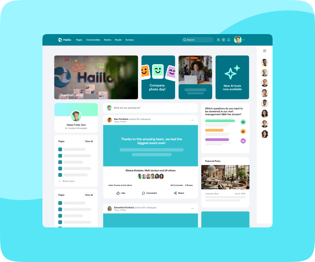
Why your homepage isn’t a dashboard, it’s a decision point
Here’s a pattern we’ve seen across hundreds of intranets:
Homepages become hoarders.
Every department wants visibility. Every update seems urgent. And before long, the most valuable real estate – your homepage – becomes a patchwork of widgets, carousels, banners, and scrolling chaos.
Our recommendation?
Be ruthless. Prioritize. Curate.
The homepage should act like a helpful concierge, not a bulletin board. Its goal is to direct users quickly, confidently. Not to showcase everything that exists.
At Haiilo, we support this through:
- Modular layouts that adapt to organizational needs
- Role-based personalization so users only see what’s relevant
- Content expiration to prevent clutter buildup
- Analytics to track what users actually engage with – not just what’s published
Essential content only: everything else is noise
A common misconception about intranet content is that more is better. More detail, more links, more context.
But the truth is, essential wins.
When you publish content, think like a UX designer:
- What’s the core message?
- What action should the user take?
- What’s the fastest path to value?
Anything beyond that is a distraction.
At Haiilo, we encourage teams to adopt a “just enough” mindset, especially when communicating across cultures, time zones, and job roles.
Intranet goals should guide design (not the other way around)
One of the most common root causes of UX debt?
Lack of a clear goal.
Too often, intranets evolve without a defined purpose. Are you optimizing for engagement? Knowledge sharing? Operational updates? Culture-building?
At Haiilo, we ask our customers to clarify their intranet’s primary function. Then, we shape the design, content hierarchy, and governance model around that focus. Without a central goal, even the best tools become directionless – and the experience suffers.
Context matters. Your intranet isn’t social media.
There’s been a tendency over the years to treat intranets like internal Facebooks. But the truth is, most employees don’t come to the intranet to socialize. They come to get work done.
Yes, your platform should feel warm, inclusive, and engaging. But that doesn’t mean mimicking social platforms. It means:
- Functional design
- Clear navigation
- Content structured around real-world tasks
At Haiilo, we design for utility first, because when people find what they need quickly, satisfaction goes up and support tickets go down.
Ownership = accountability = clarity
UX debt thrives in the absence of ownership. When no one owns a page, no one maintains it. When everyone owns it, no one curates it.
We guide customers toward decentralized but clear governance:
- Assign owners to every section
- Create lightweight content workflows
- Set review and expiration cycles
- Use Haiilo’s content lifecycle tools to flag outdated or unused items
This isn’t about control. It’s about care. Your intranet should evolve with your organization, instead of calcifying under legacy content and unclear responsibility.
💡Read: Why IT shouldn’t be running your intranet anymore
Final thought: less friction, more focus
The best intranets feel invisible.
They don’t demand attention, they support it. They don’t add steps, they reduce them. And they don’t confuse, they clarify.
At Haiilo, UX is more than how something looks. It’s how something works – for the people who use it every day, under pressure, across roles, locations, and devices.
If your intranet feels like a mess, it’s not your fault. But it is an opportunity. With the right design approach, you can clear the clutter, cut the debt, and create something genuinely helpful.
Something people actually want to use.
Need help designing a better intranet experience?
Our team at Haiilo partners with HR and internal comms teams every day to optimize intranet usability, declutter content, and build experiences employees actually love. Let’s talk UX.
Why does this matter?
Today’s workforce is overwhelmed
- Employees juggle 35+ apps daily, wasting 61% more time than necessary
- 70% of employees lose 20 hours per week to fragmented systems
- 68% of organizations fail to achieve the desired ROI from digital transformation efforts
How can Haiilo help?
Haiilo helps IT teams do more with less – without adding complexity.
You don’t need more tools. You need better integrations, smarter automations, and less complexity. Haiilo is your intuitive Digital Home, and it brings together the tools you already love without overloading IT.
With Haiilo, you can:
- Improve user adoption with an interface employees actually enjoy using.
- Cut through the noise with smart, automated, and hyper-relevant updates.
- Eliminate tech bloat with 130+ integrations – everything in one place.
- Track usage, measure engagement, and optimize effortlessly.
The Impact:
- 75%+ frontline employee adoption
- 67% increase in productivity through smarter workflows
- $2.4m saved annually by reducing staff churn and inefficiencies
Interested in how Haiilo could work for your team? Let’s talk.
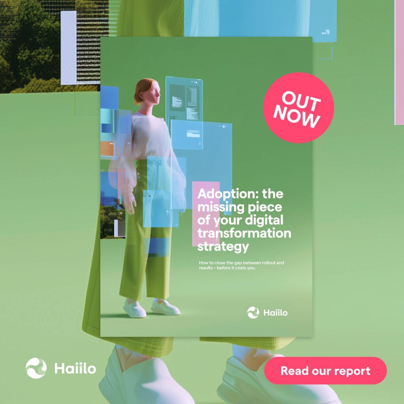
See our latest report on how to solve your digital adoption problem.